

In 2024, as a Lead Senior Product Designer at Pulsora, I faced some big design challenges that were holding us back. Without a unified design system, our projects often felt inconsistent, teamwork between designers and developers was clunky, and the overall user experience suffered. This made onboarding new clients slower than it should have been and negatively impacted user retention, which fell below industry standards.
To tackle these issues, I conducted a thorough study to pinpoint the key pain points and took the lead in implementing a comprehensive design system. Collaborating closely with a design manager and developers, I transformed designs into reusable components, ensuring consistency and scalability. I used tools like Figma, whiteboards, and JIRA to streamline the workflow and structure our design process, enabling more efficient collaboration and better outcomes.
Role
Senior Product (UX) Designer
Client
Pulsora
Year
2024
Timeline
6 Months
Final Product

How it all started ?
One rainy afternoon, I was sipping my coffee, watching the raindrops race down the windowpane, when my phone buzzed—a team meeting had just been called by my manager. I quickly grabbed my notepad and dashed into the boardroom, where the team was already gathering to map out our goals for 2024.
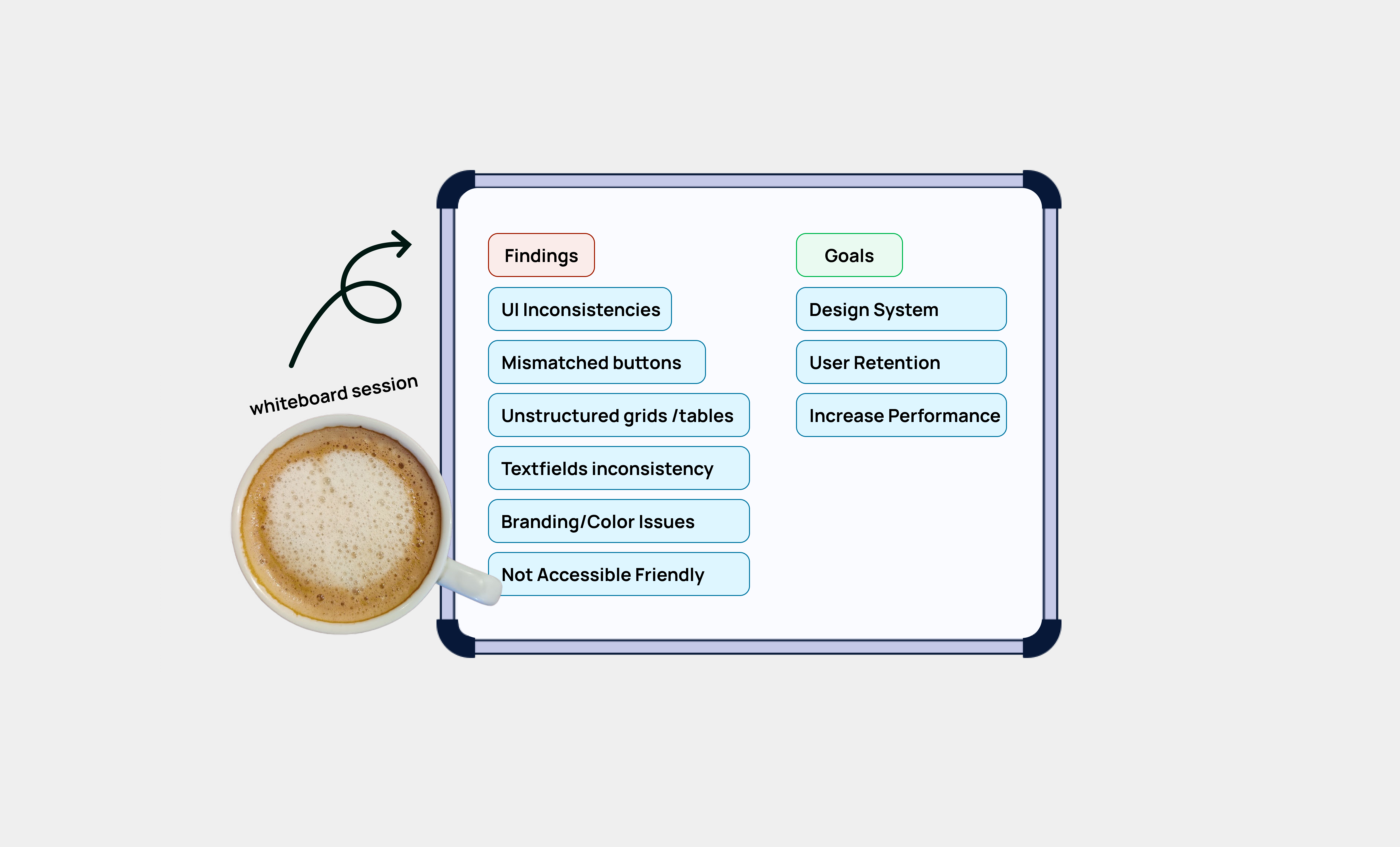
As we dive into the discussion, a major theme started to emerge: user frustration. Our clients were grappling with inconsistencies in the interface—from mismatched buttons and text fields to grids, checkboxes, and radio buttons. At first glance, these issues might seem trivial, but trust me, they mattered—a lot. For our clients, these inconsistencies translated to a fragmented user experience, undermining trust in the platform.
It became clear during the meeting that the root of the problem was our scattered approach to design. With the design team spread across multiple projects, each designer created their own components for specific tasks, passing them on to developers without a unified standard. The result? A patchwork of mismatched elements that lacked cohesion and frustrated users. We knew something had to change, and that meeting became the catalyst for a bold new initiative.
Before the design system, pulsora’s design processes were marked by inefficiencies -
Inconsistent Components
Components like buttons, forms, and modals were designed multiple times, often with differing styles and behaviors.
Inefficient Collaboration
Designers and developers worked with disconnected tools and frameworks, resulting in misaligned outputs.
Fragmented User Experience
The lack of cohesion across digital touchpoints confused users, impacting retention.
Delayed Client Onboarding
The inconsistent design processes extended project timelines, delaying client onboarding.
Create a centralized, reusable component library.
Standardize design principles to ensure consistency.
Improve collaboration between designers and developers.
Enhance the user experience to boost retention and accelerate client onboarding.
Phases of the Process

Audit and Discovery
Conducted a comprehensive audit of existing design assets and components.
Identified frequently used components and their variations.
Collaborated with stakeholders to understand pain points and priorities.
Define Design Principles
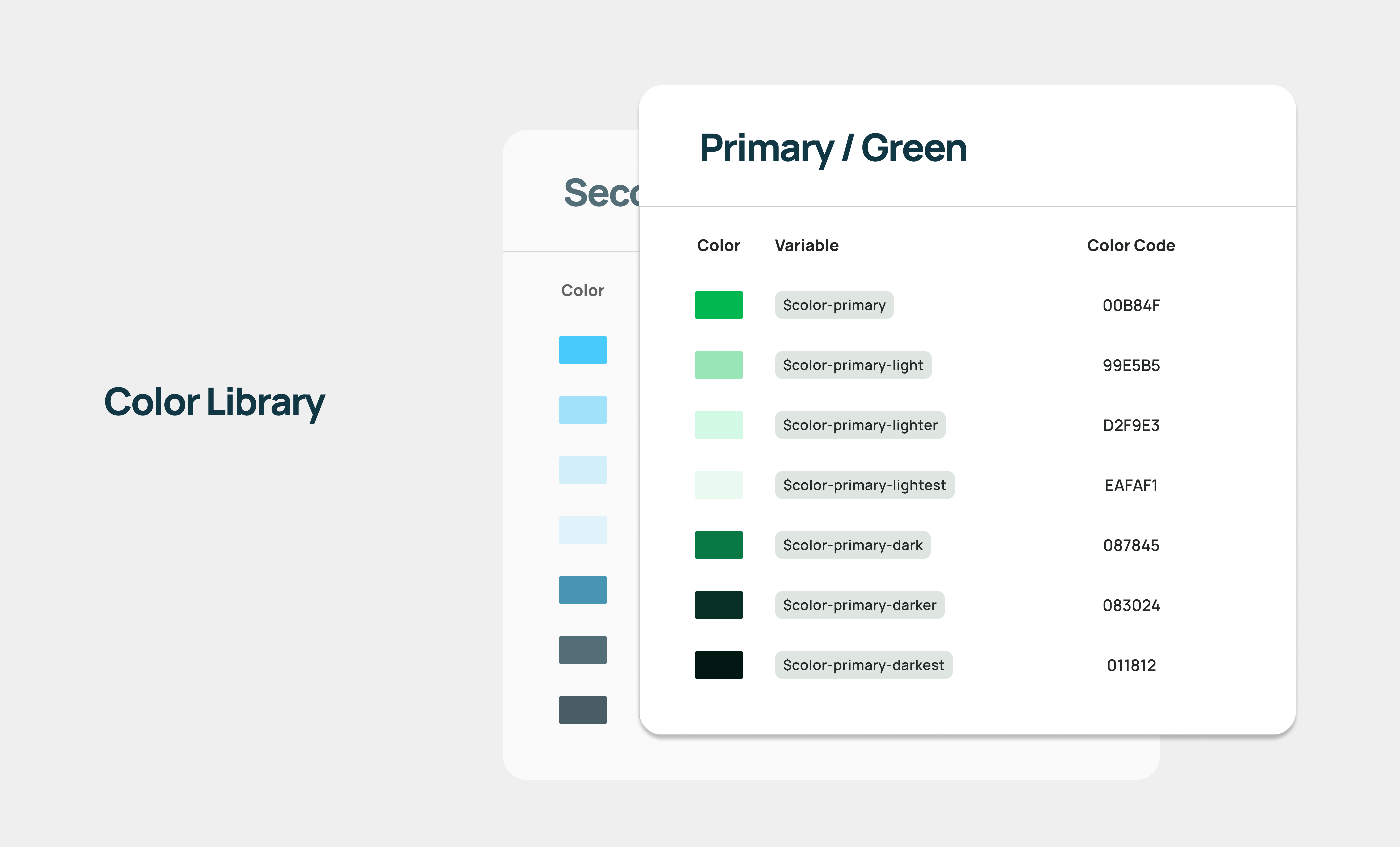
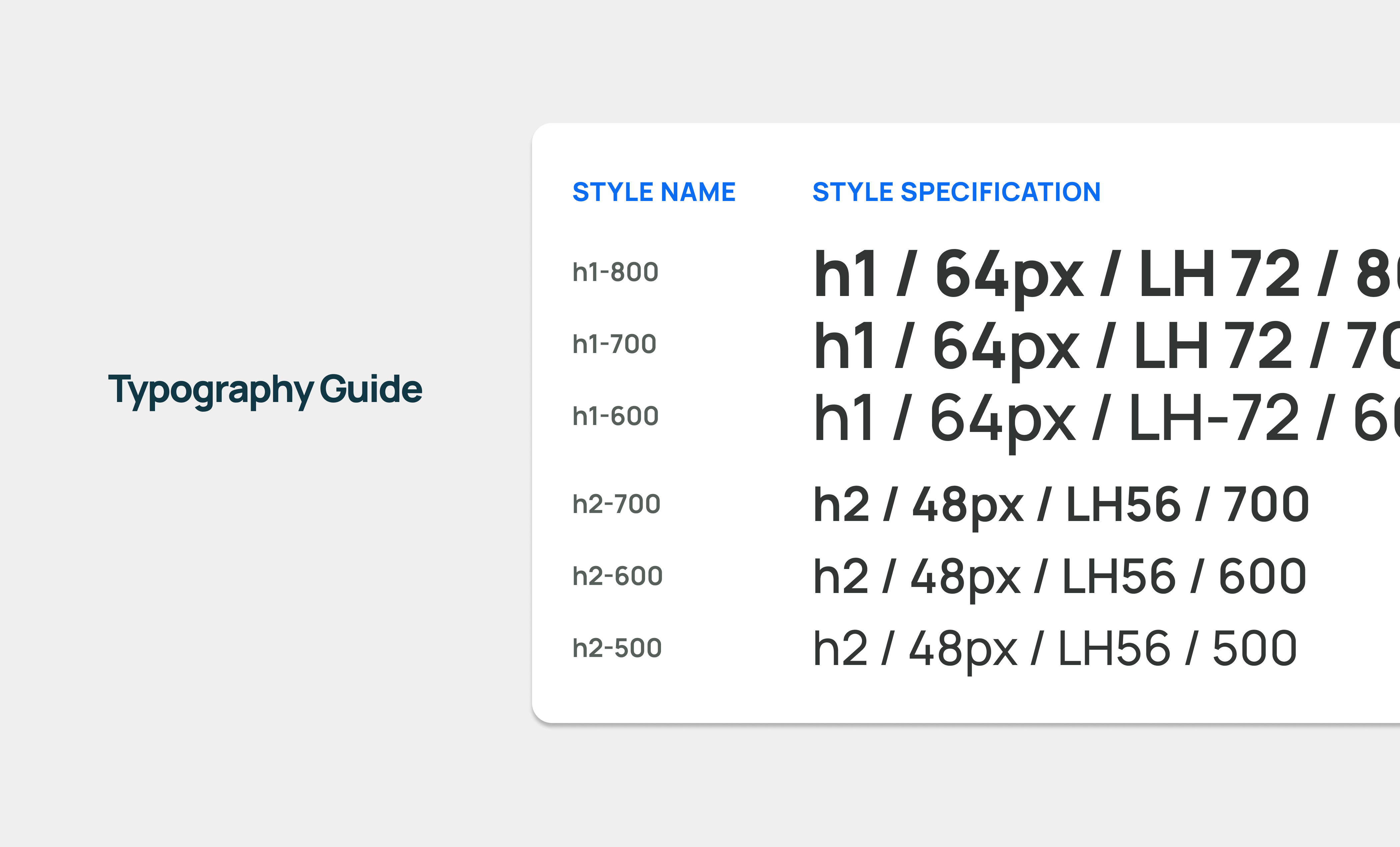
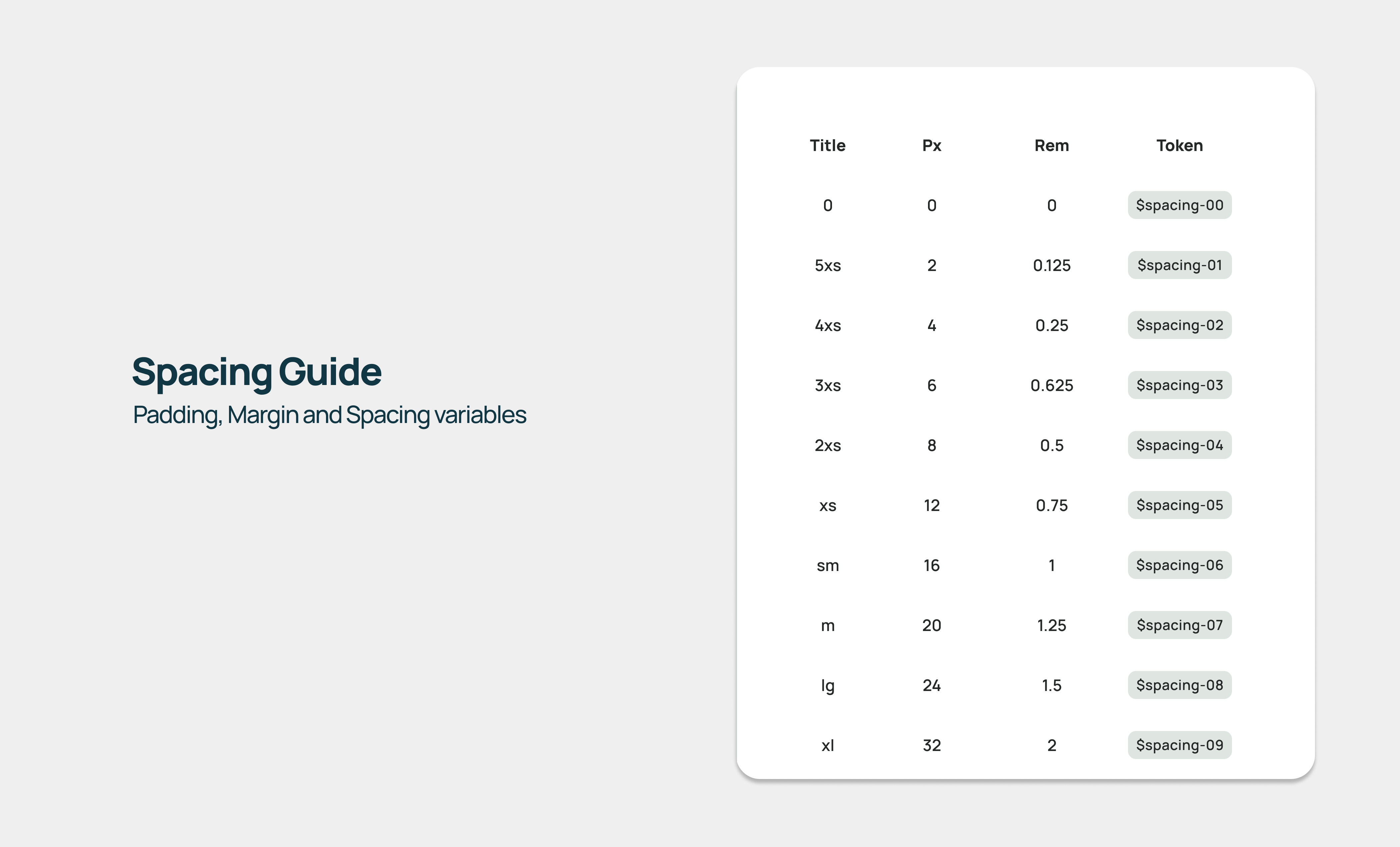
Established core principles for typography, color palettes, spacing, and accessibility.
Created a style guide to align the entire team on a unified visual language.
Build the Design System
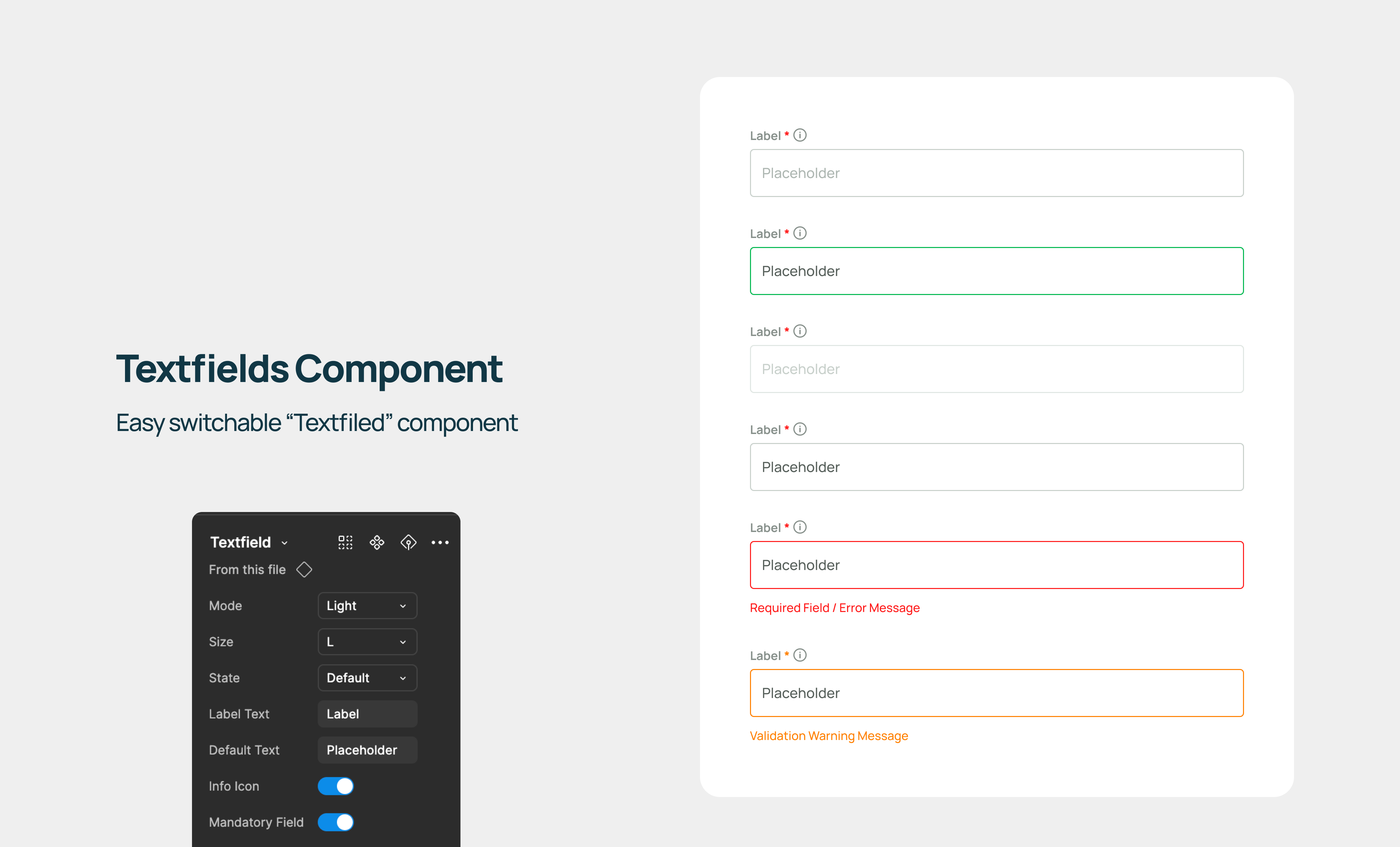
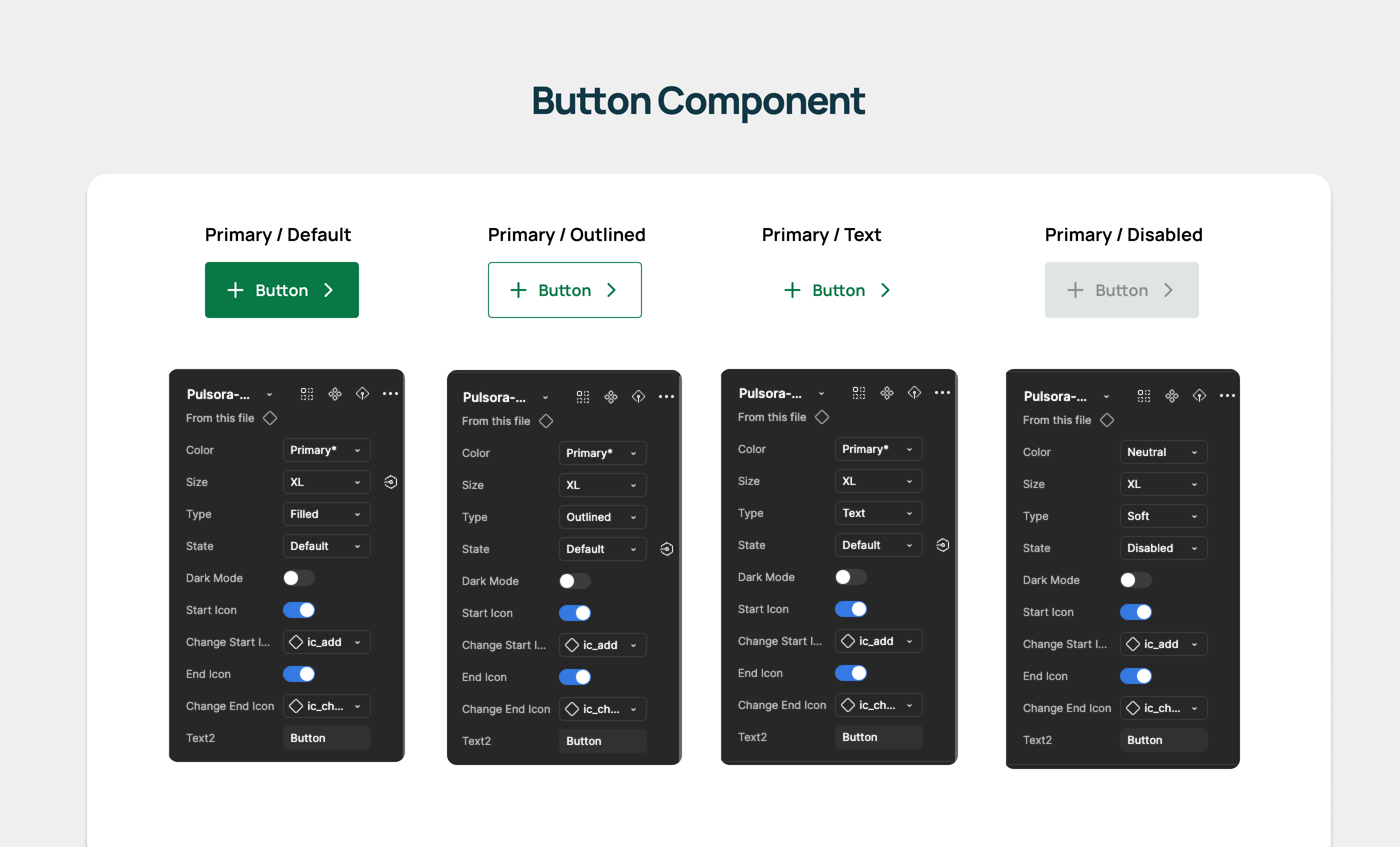
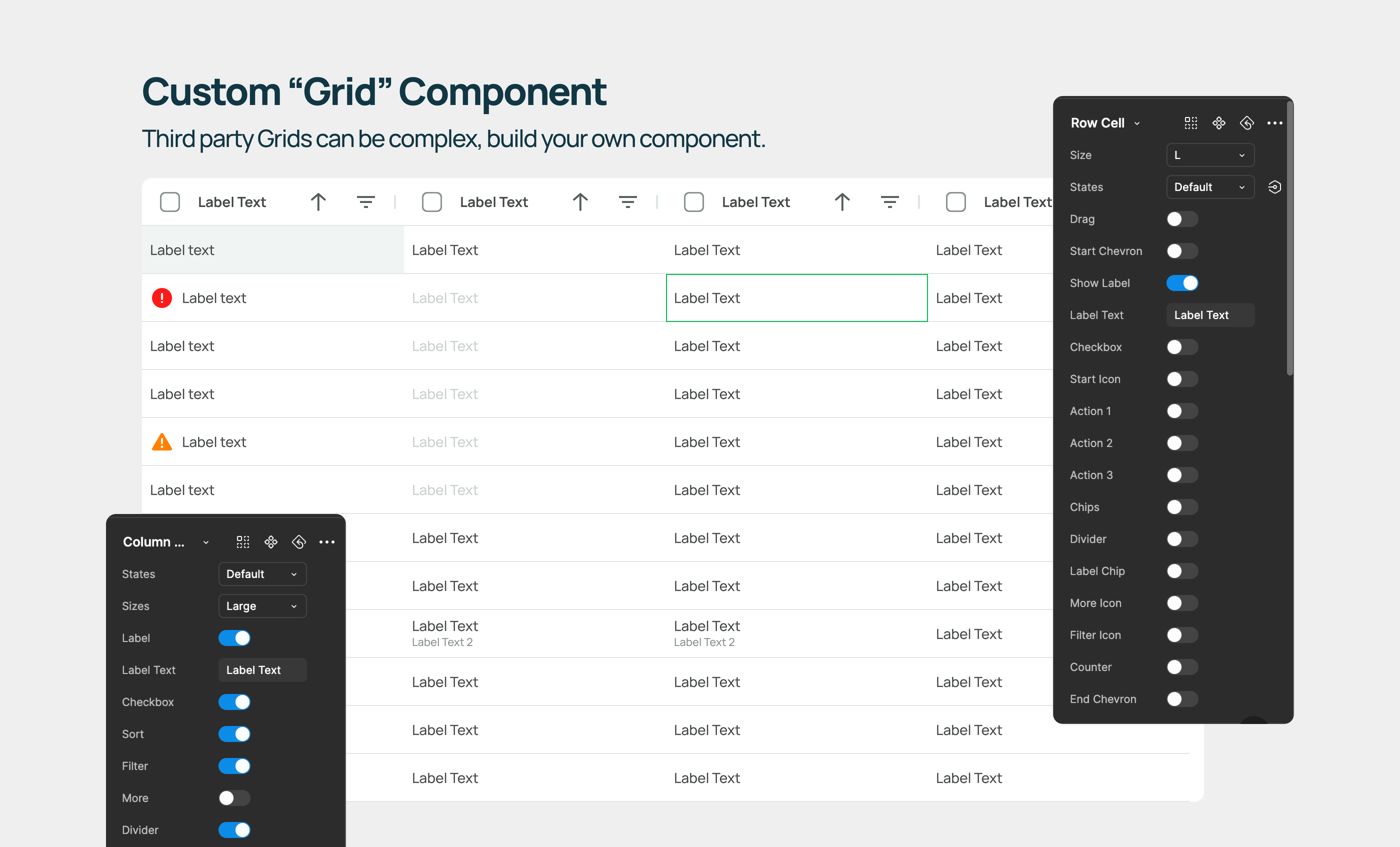
Designed a centralized library of reusable components in Figma.
Collaborated with developers to integrate the design system into the codebase using React and Storybook.
Documented each component with detailed guidelines, including use cases, variations, and best practices.
Team Adoption
Hosted workshops to onboard designers and developers to the new design system.
Created a feedback loop to iterate and improve the system based on team input.
Testing and Iteration
Tested the design system on live projects to validate its effectiveness.
Gathered user feedback to refine components and address usability issues
Color
Shadows
Typography
Spaces & Margins
Buttons
Switches
Checkboxes
Radio Buttons
Inputs
Chips & Labels
Badges
Date pickers
Tool Tips
Notes
Notifications
Alerts
Progress Bar
Scroll Bar
Breadcrumbs
Navigation
Grids and Menu
Accordions
Cards
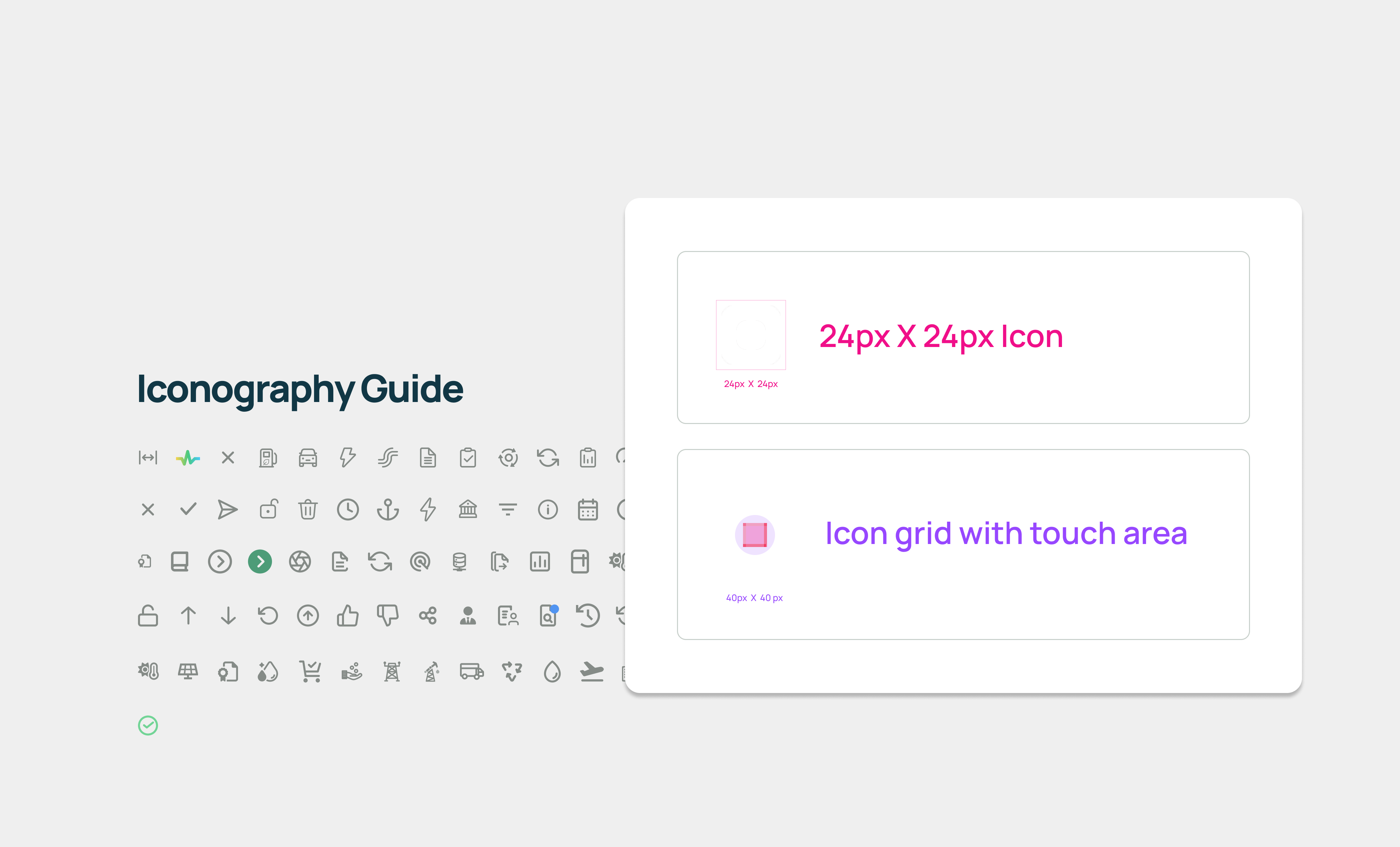
Iconography
AG grid
The design system completely revolutionized the way we operated, delivering noticeable improvements across the board.
Improved Efficiency
We were able to cut down design and development time by 30% by eliminating redundant efforts. With reusable components in place, our workflow became streamlined, allowing the team to focus on creating innovative solutions rather than redoing the same tasks.
Consistent User Experience
A unified look and feel across the platform made all the difference for our users. The consistency in buttons, text fields, grids, and other UI elements not only enhanced usability but also built trust and reliability in our product.
Higher User Retention
By providing a seamless and cohesive interface, we saw retention rates climb by 15–20%. Users stuck around longer and engaged more with the product, which was a clear sign that we were meeting their expectations.
Faster Client Onboarding
What used to be a slow and cumbersome onboarding process improved significantly, speeding up by 20%. This allowed us to onboard clients more efficiently, giving the company the ability to scale with ease.
Enhanced Collaboration
The introduction of the design system also brought the team closer together. Designers and developers, who previously worked in silos, started collaborating more effectively. With a common framework to rely on, communication became smoother, friction decreased, and productivity soared.
By implementing a robust design system at Pulsora, I transformed the organization’s design processes and directly contributed to its business growth. This initiative not only addressed the inefficiencies and inconsistencies but also empowered the team to deliver high-quality, user-centric solutions.
Small details matter
I learned that even the tiniest design inconsistencies can have a huge impact on user satisfaction and retention.
Scalability starts with structure
Implementing a design system showed me how critical a strong foundation is for supporting growth and onboarding clients faster.
Empathy drives solutions
Understanding user frustrations on a deeper level helped me prioritize and address the real issues impacting their experience.